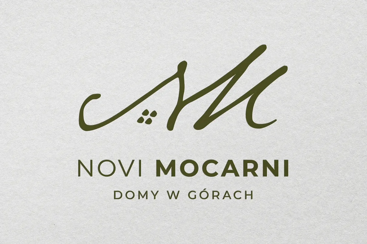
Logo and Website for Novi Mocarni
Novi Mocarni is one of the investments by our regular client, located in the heart of Podhale. The inspiration for the entire concept – both the investment’s logo and its website – came from the local highlander tradition.
The logo is not only a neat combination of the letters N and M, the initials of the name, but also an analogy to the three peaks surrounding the investment. Furthermore, while designing the letter N, our graphic artist proposed small windows that transparently reflect the shape of a traditional highlander cottage, which inspired the architects of the Wawel Service development company.
Branging
Novi Mocarni


